How to not suck at design, a 5 minute guide for the non-designer.
Good design principles can be learned and exercised by anyone. This guide will give you a basic knowledge of practical design tips you can apply today (and impress your design friends).

If you don’t believe you can learn design, just remember what our legendary friend David Eric Grohl said about learning new things:
I never took lessons to play the drums. I never took lessons to play the guitar. I just sort of figured it out. I think that if you’re passionate about something and you’re driven and you’re focused, you can do anything you want to do in life.
— Dave Grohl, Foo Fighters
With Mr. Grohls words in mind, are you ready for your crash course? Buckle up buttercup, here we go in no particular order:
1. Use plenty of contrast
The background and font color should be different enough to not cause eyestrain. Typically black text on white backgrounds tends to be the most legible. Stay away from the light gray, yellows and greens. If you have to squint to read then you know you have a problem.
2. Almost Black is easier to read than Black
If you have the choice, try using the color #333333 RGB (51,51,51) instead of pure black for your text. Pure black on white jiggles for the eye and makes the letters hard to focus on.

3. Important Content First
Layout the most important information first to clearly support the primary use case of your app or website. Important content should be visible without zooming or scrolling or tapping.
Lets view some examples of good visual hierarchy in the wild.
Instagram (below, on the left) puts a clear focus on the photo/video posted by the user.
Pinterest (below, on the right), creates visual hierarchy by pinning their search bar to the top followed by their nice grid below. Pinterest is very intentional about having their search box as the first item on the page.
Search is the core function of the app, folks use Pinterest to discover and browse.


Lets look at two more examples
Spotify (below, on the left) clearly is celebrating the album artwork and song title first and player controls second. Even though the player controls are secondary, Spotify gives more weight to the play and pause button over fast forward and reverse.
Facebook (below, on the right), looking very similar to Instagram, chooses to put the content of your friend front and center.


4. Align all the things
The fastest way to fix something that feels off or janky is to make sure the alignment is not off. When designers talk about the need to use a “grid” they are trying to alert the team to the issue of mis-alignment.
Fixing alignment is one of the easiest improvements we can make to any app or website and instantly makes an app or website look 10x better.
Lets look at another alignment example, this time from medium.com

Here is a web layout I tweaked from Medium.com — how does this look to you?
Does anything feel off about this layout?
Hint: notice the alignment on the left edge. How does it look?
On the left I highlighted the visual river caused by mis-alignment, on the right I simply left aligned all the major content blocks.


5. Text size with spacing
We are not designing for ants.
Increasing font size will make your content much easier to read and digest coupled with some liberal line spacing.


6. Use a list view for results, if order is important
Most mobile and web apps have some type of search and there can be some healthy design debates on how to display the results.
If order is important then a list view is most effective.
If order doesn’t matter and you would like to encourage discovery (like Pinterest or AirBnB) then a grid view will encourage a gaze pattern to support discovery.

7. Design in black and white first, add color later
Designing in black and white will keep the focus on solving and designing the core experience of your app.
Color evokes strong emotional responses and often interrupts our ability to focus on the core design problem.

8. Create comfortable design
Hand strain is a real issue, consider the graphic below from Luke Wroblewski’s amazing article: Responsive Navigation: Optimizing for Touch Across Devices.
Luke lays out the areas of a phone that are easiest to reach and use (at least for right handers) — I’d love to see apps have a setting where you can switch the interface from right hand dominant to left hand dominant.
Many effective mobile apps keep navigation and core actions in the bottom third of the phone.

9. Borrow Color Palettes
Color is a bit of an elusive dark art. I highly recommend heading over to Dribbble and searching for “Color Palettes” or use a color palette generator like Coolors or Color Claim.
Save yourself the hours of endless debate and second guessing.

10. Use Apple and Google OS Conventions
Apple and Google have created incredible resources for anyone building software for Android or iOS.
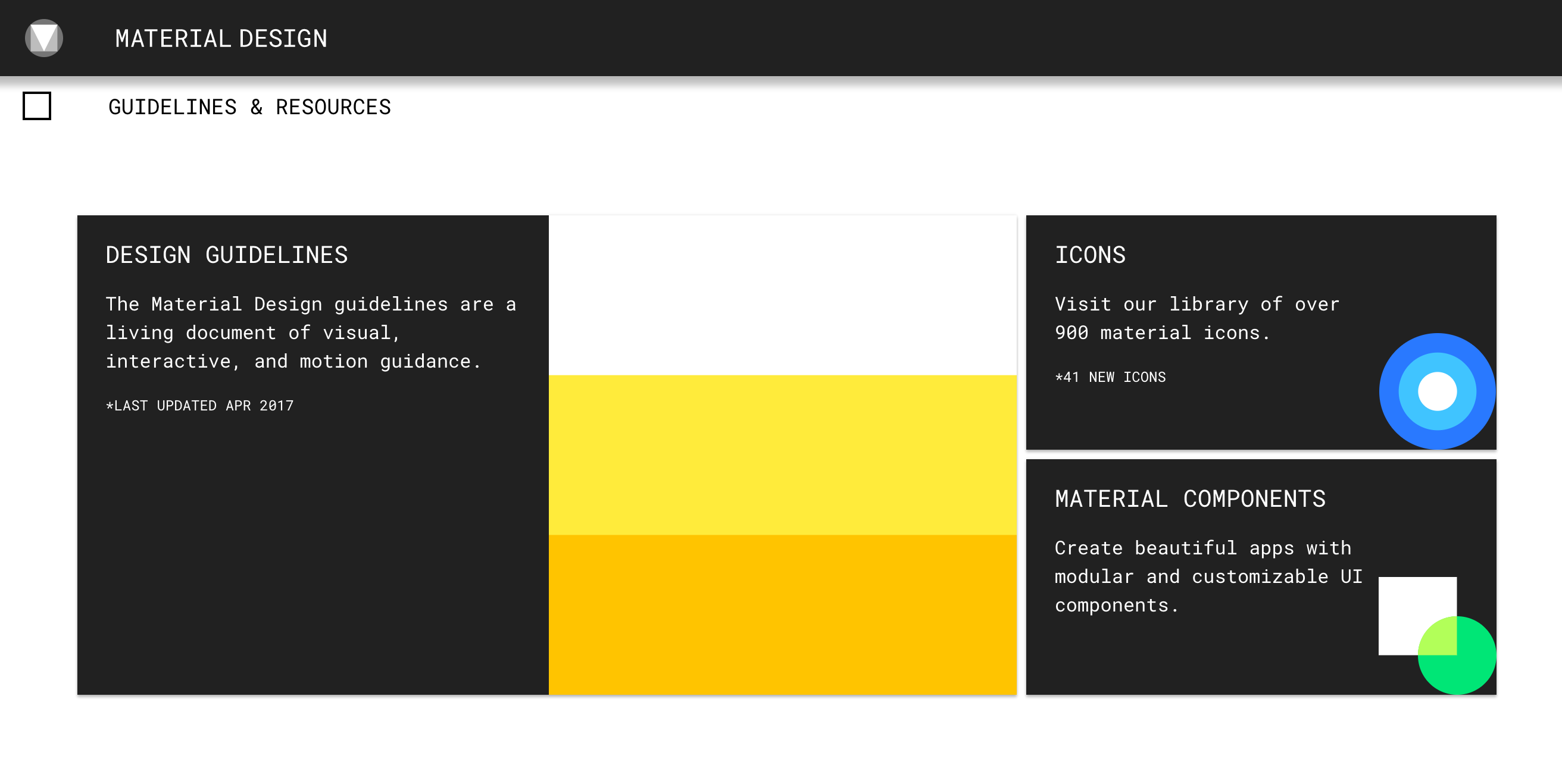
For example, the Google Material spec has guidelines, resources, colors, icons and components to help jump start the design of your app.
Apple has the HIG — their Human Interface Guidelines, which outline everything you need to know on how to design an iOS app.
Remember, design takes practice
Training your eye to look for the design issues takes a bit of time and practice, but you will find the above tips will go a long way to making anything you create better designed.
If you found this article helpful please tap or click “♥︎” and recommend this and share this with a friend who needs design help :)


